
Case Study
Chichiluna: The Redesign
Turning a functional storefront into an editorial brand experience, built around the story behind every piece.
Picking Up Where Phase One Left Off
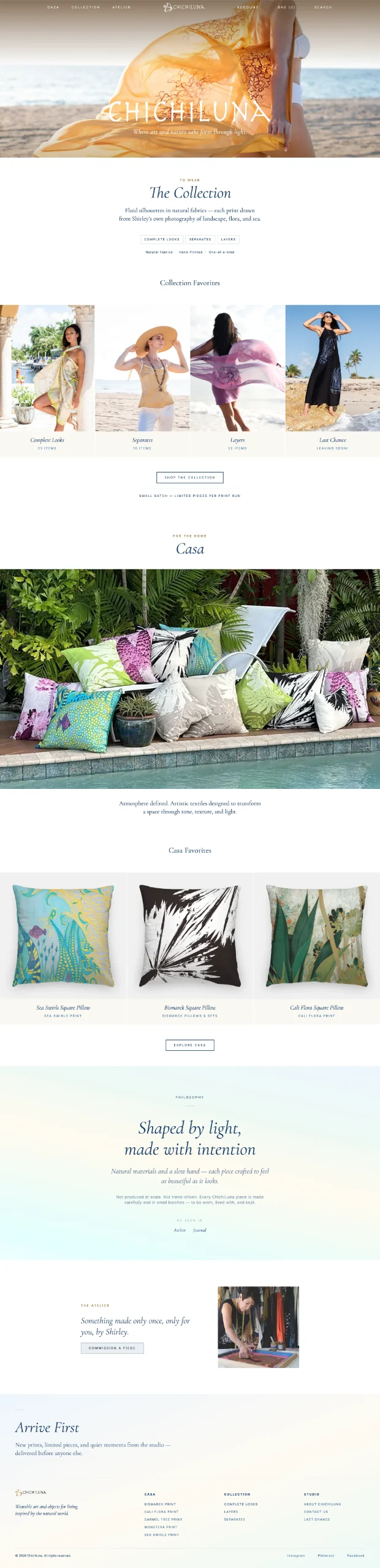
After the migration and email cleanup, Chichiluna was stable, but still wearing a fairly generic boutique storefront: a script logo, a lavender palette, and the brand’s story split awkwardly across a separate About page, a separate Sustainability page, and part of the Contact page. None of it matched the quality of what Shirley actually makes. This phase was a full rebuild: new theme, new block system, new information architecture, and new copy for every page that wasn’t a product description.
A Custom Block Library, Not a Page Builder
Rather than bolt on a third-party page builder, I built a purpose-made Gutenberg block library for this theme: hero variants, category and product grids, testimonial sliders, accordions, bento layouts. Every page could be assembled from real, reusable pieces instead of one-off templates. It’s the same foundation I use across other client sites, tuned here for a small-batch retail brand.
Rewriting the Story, Not Just the Design
The homepage, the Atelier page, and every category page got new copy along with new layout. Shirley’s process, materials, and philosophy came out of three disconnected pages and into one considered narrative: from nature, to print, to hand-finished garment. Product descriptions stayed Shirley’s own words; everything around them was rebuilt to give that work a frame worthy of it.
Merchandising Built Around Color Stories
Chichiluna’s catalog isn’t organized by SKU. It’s organized by color story: Back to Nature, Blue Lagoon, Midnight Magic, Peace Within, PinknWine. I rebuilt how the catalog groups and orders products so pieces from the same collection display together instead of scattering by publish date, and rebuilt “related products” to pull from a piece’s own color story instead of a random cross-sell. A shopper looking at a PinknWine piece now sees the rest of PinknWine, not an unrelated dress from a completely different palette.
A Dead End That Isn’t
Everything is handmade in small batches, so pieces do sell out for good. Collections being phased out get their own Last Chance section while they’re still available. For anything that’s already gone, instead of a generic broken-link page, the 404 becomes another way to browse. It surfaces the Color Stories grid, so a shopper who lands on a sold-out piece finds their way back into the collection instead of hitting a wall.
The Details That Don’t Show Up in a Screenshot
A custom product gallery with a thumbnail strip in place of WooCommerce’s default slider, product details moved into an accordion right under Add to Cart instead of buried below the fold, a live cart count that updates as quantities change, and category hero images with independently adjustable focal points for desktop and mobile.

By the Numbers
5 color-story collections. A 20+ block custom design system. One continuous brand narrative, start to finish.